
The Helldivers logo is the official visual emblem of the sci-fi cooperative shooter franchise created by Arrowhead Game Studios. At its core, the design represents an elite military force, featuring a stylized tactical helmet set inside a winged badge alongside blocky, stencil-style typography. This guide breaks down the meaning, history, and design choices behind the insignia.
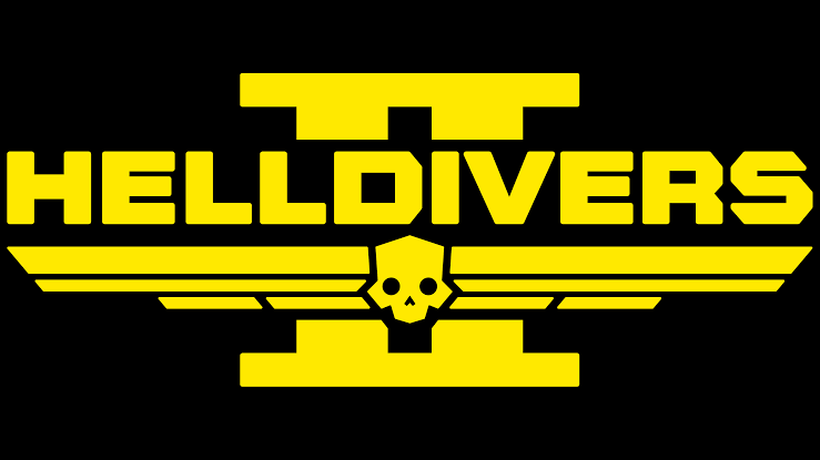
The official Helldivers 2 wordmark and emblem. Source: Logos-World.net
What Is the Helldivers Logo?
The Helldivers logo serves as the primary brand identity for the action-game franchise published by Sony Interactive Entertainment. It consists of two main elements:
- The Wordmark: Heavy, stencil-inspired lettering spelling out HELLDIVERS (and HELLDIVERS II for the sequel).
- The Central Emblem: A sharp, angular icon featuring a stylized tactical helmet flanked by wings.
Players encounter this visual mark constantly. It appears on game packaging, digital storefronts, and official merchandise. Inside the game, the emblem marks player armor, capes, drop pods, and military equipment.
Franchise Logo vs. Super Earth Symbols
It helps to distinguish between the Helldivers insignia and broader Super Earth symbols. The Helldivers logo refers specifically to the player’s combat unit—the Helldiver Corps. The Super Earth symbol represents the fictional global government as a whole, typically featuring a globe surrounded by laurels or a stylized eagle. The Helldivers badge exists as a branch-specific military patch nested within that wider Super Earth faction identity.

The broader Super Earth faction symbol. Source: pandorassteakhouse.com
What Does the Helldivers Logo Mean?
The Military-Inspired Visual Identity
The sci-fi military branding takes direct visual cues from mid-20th-century airborne unit patches and tactical badges. Its sharp angles, geometric symmetry, and aggressive stance reflect an elite orbital drop force deployed into high-risk combat zones.
The Symbolism Behind the Emblem
When examining the emblem’s distinct visual parts, we can separate confirmed design choices from community interpretations:
- The Helmet Silhouette: The central mask mirrors the iconic helmet worn by player units. It represents anonymity, unity, and total combat readiness.
- The Wings: Stylized wings extending outward draw inspiration from traditional military airborne and paratrooper insignia. They hint at the squad’s drop-from-orbit deployment style via Hellpods.
- The Chevron Stripes: Positioned beneath or around the main mark, these lines echo rank badges. They convey chain-of-command, structure, and tactical discipline.
- Skull Interpretations: Fans often associate the angular lower half of the helmet with a stylized skull. While skull motifs appear across military history to represent mortality and shock tactics, Arrowhead Game Studios has not released a formal breakdown confirming intentional skull symbolism. Visually, it remains an aggressive combat mask.
How the Logo Fits the Super Earth Theme
The logo acts as a piece of in-universe propaganda. The franchise presents a satirical view of militarized, authoritarian patriotism. The logo’s bold, heroic style creates an image of unstoppable grandeur—which sharply contrasts with the chaos, friendly fire, and high casualty rates players actually experience during missions. This deliberate disconnect between the pristine, state-approved propaganda and the messy reality of combat defines the game’s dark humor.
Helldivers Logo Design: Colors, Typography & Symbols
Color Choices
The visual brand relies on a strong palette of high-visibility yellow or gold set against dark grey and matte black backgrounds.
In real-world industrial and military contexts, bright yellow signals hazard, warning, and high energy. In-game, this contrast makes text and UI design pop against dark space environments or smoke-filled battlefields. The black tones provide grounding, giving the logo an industrial, ops-focused tone.
Typography and Lettering
The logotype uses custom, blocky lettering with clean, hard edges. The letterforms resemble heavy stencil cuts found on tactical crates or armor plating. This heavy weight creates an immediate sense of strength, authority, and durability.
The Central Emblem
The emblem combines the helmet icon with geometric wings and chevrons into a single, compact silhouette. Its symmetry allows it to scale down smoothly into a tiny icon on a player’s screen or scale up for massive promotional billboards.
Why the Design Is So Recognizable
- High Contrast: Bright yellow on dark grey ensures instant visibility.
- Clean Silhouette: The helmet-and-wings shape remains readable even at very small sizes.
- Industrial Aesthetic: The blocky stencil design aligns perfectly with popular cooperative shooter art tropes.
- Consistency: The visual brand has remained coherent from the 2015 original through the 2024 sequel.
Helldivers Logo History: From the Original Game to Helldivers 2
The Original Helldivers Logo
When the original game launched in 2015, Arrowhead Game Studios introduced a clean, high-contrast visual identity. The top-down tactical game needed clear UI icons, so the original logo used crisp lines, flat yellow tones, and a readable helmet motif.
The Transition to Helldivers 2
With the release of the sequel in early 2024, the franchise shifted to an immersive third-person perspective. The visual identity updated to match this larger, cinematic scope while maintaining complete franchise continuity.
How the Helldivers 2 Logo Evolved
The updated Helldivers 2 emblem features refined textures, subtle metallic lighting effects, and a large Roman numeral “II” integrated directly behind the wordmark. Rather than changing the core identity, the designers modernized the classic emblem to fit current-generation rendering standards.
Why the Helldivers Logo Fits the Game So Well
The logo succeeds because it reinforces every major thematic pillar of the franchise. It mirrors real-world unit patches and futuristic combat badges. The shield and emblem structure evokes unit pride and squad unity.
Crucially, it looks exactly like state-approved propaganda. The emblem promises recruits an elite, heroic status, maintaining the satirical disconnect between Super Earth’s glorious marketing and the brutal, chaotic reality of the actual gameplay.
Helldivers Logo vs. Super Earth Logo: What’s the Difference?
Players new to the lore often confuse the Helldivers logo with the Super Earth logo.
- Helldivers Logo: Focuses on tactical combat equipment, featuring the soldier’s helmet, wings, and strike-force stencil lettering. It represents the Helldiver Corps—the military branch deployed via Hellpods.
- Super Earth Logo: Represents the global government entity as a whole. It typically features planetary outlines, globe grids, or civilian-facing state seals.
Think of the Super Earth logo as a national flag, while the Helldivers logo acts as an elite unit badge worn on a soldier’s shoulder patch.
Helldivers Logo vs. Helldivers 2 Logo
| Feature | Original Game (2015) | Helldivers 2 (2024–Present) |
| Game Era | 2015 top-down isometric shooter | 2024 third-person action shooter |
| Visual Identity | Classic arcade sci-fi presentation | Cinematic, high-budget military sci-fi |
| Wordmark | Flat, clean stencil typography | Textured wordmark featuring prominent “II” backdrop |
| Overall Feel | Tactical twin-stick action badge | Cinematic blockbuster military emblem |
| Franchise Continuity | Established core helmet & wing iconography | Built upon and refined existing assets |
Who Created the Helldivers Brand?
Arrowhead Game Studios, a Swedish game development studio founded in 2008, created the franchise.
According to developer commentary, the name “Helldivers” draws inspiration from two main places. First, the developers connected the phrase “war is hell” with the physical act of “diving into combat” via atmospheric drop pods. Second, they looked at historical military hardware, specifically the Curtiss SB2C Helldiver, a WWII dive-bomber aircraft used by the U.S. Navy.
Arrowhead has not publicly credited specific graphic designers for the individual logo files. Any claims attributing the design to a single person online remain unverified studio work.
Helldivers Logo in the Game’s World
In-universe, logos drive the world-building. The Helldivers emblem appears on drop pods that smash into enemy planets, custom capes awarded to recruits, and recruitment posters promoting enlistment to Super Earth citizens. By embedding the logo into every layer of the user interface and environment, the developers constantly reinforce the feeling of operating under a central military regime.
Here again, the logo serves as pristine state propaganda, sharply contrasting the gritty, high-casualty reality of the warzone.
Is the Helldivers Logo Officially Available for Download?
Many players search for high-resolution PNG or SVG files of the logo for wallpapers, streams, or fan projects.
Official promotional artwork and media kits remain available through PlayStation press portals or community kits released by Arrowhead. Meanwhile, many PNG download sites and vector repositories host fan-recreated versions of the logo. Always verify your sources before downloading files from third-party sites to avoid low-quality conversions or unsafe downloads.
Can You Use the Helldivers Logo?
Before using the logo for personal or creative work, keep standard legal considerations in mind. Creating fan art, non-commercial stream overlays, or personal wallpapers generally falls under standard fan-content allowances, provided you do not monetize the assets or claim ownership.
Selling merchandise, t-shirts, physical prints, or digital assets featuring the logo violates trademark and copyright protections held by Sony Interactive Entertainment and Arrowhead Game Studios. Check official PlayStation brand guidelines before starting any commercial projects.
Frequently Asked Questions About the Helldivers Logo
What does the Helldivers logo mean?
The logo represents the Helldiver Corps, an elite military unit. Its helmet icon, wings, and stencil text symbolize readiness, orbital drop tactics, and high-intensity combat.
What does the Helldivers 2 logo represent?
It represents the evolution of the franchise into a third-person cinematic shooter. It keeps the iconic helmet emblem while adding metallic textures and a background Roman numeral “II” to signify the sequel.
Who designed the Helldivers logo?
The art team at Arrowhead Game Studios created the logo in partnership with Sony Interactive Entertainment.
Is the Helldivers logo different from the Super Earth logo?
Yes. The Helldivers logo represents the specific combat unit (the Helldiver Corps), while the Super Earth logo represents the overall governing faction.
When was the original Helldivers logo introduced?
The original visual identity debuted alongside the first game launch in 2015.
Is the Helldivers logo copyrighted?
Yes. The logo, branding, and related visual assets are protected trademarks owned by Sony Interactive Entertainment and Arrowhead Game Studios.
Can I use the Helldivers logo for a fan project?
Non-commercial fan work typically falls under standard fan-use practices, but commercial use or selling unauthorized merchandise remains strictly prohibited.
To explore more about game branding and design:
How to design a sci-fi military logo
Compare Helldivers 2 with other co-op shooters